
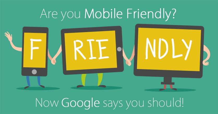
Recently, Google made a statement that the volume of search queries on mobile devices has now surpassed desktop. This along with their most recent algorithm updates means that much more value is being given to well-designed mobile websites. Desktop sites failing to conform to the standard are likely to witness a marked decline in SEO rankings and traffic.
So what does this mean for mobile web designers & marketers?
Well for starters, if you haven’t created a mobile website or introduced responsive features into your existing one, you are likely missing out on valuable SERPs rankings and traffic since the majority of your users will likely be visiting on their phones.
Here are 7 suggestions you need to know to update your website to modern mobile standards.
1. Understand usability
Usability is arguably the most important aspect of a mobile website, after all; would you buy an unsteerable car? The same point can be made for your website, your users don’t want to visit a site they can’t use.
You should start off by viewing your current website on your mobile. If you have to pinch in and zoom around to read everything, and it takes several attempts to navigate to a new page, you’ve gotten a clear view of the mobile experience you are offering your users.
2. A responsive website isn’t always the best answer
Depending on your current website, you may want to consider developing a responsive theme that adapts to your users’ browser or device resolution. However, sometimes this isn’t achievable and you may want to opt for a dedicated mobile website instead.
Building a separate mobile site has its benefits, for example they are often easier to develop than integrating responsiveness into your existing site and costs can often be significantly less (especially when using a third-party mobile website builder), however a separate mobile page means you will have to maintain 2 different code bases and upload content to both.
Whichever route you decide to go down, research is needed to ensure which option is more suited to your marketing and business model in the long run.
3. Study the trends of mobile web design and UX
If you take a look at mobile design trends over the last two years, you will notice a lot of attention is given to minimalism and simplicity of design. Seeing as though there’s less screen space to work with, designers like to make the most of the elements on the page, highlighting and maximizing empty space in order to draw attention to the navigation and usability features that are integral to the UX.
Recent mobile designs have included such features as the ‘hamburger menu’ – a navigation menu hidden from view until the user taps on the three horizontal lines in the corner (resembling a hamburger – hence the term). You may have seen it integrated into desktop sites, however, this feature is incredibly useful for mobile web as it keeps the navigation off of the page, saving space for more important page elements whilst being universally recognized as a navigational function.
Another UX functionality in mobile web design involves the way users’ complete forms. Whether it’s to sign up for an account or to enter their billing details after a purchase, desktop sites have usually displayed the entirety of the information on one page. Suffice to say, there is the issue of minimal screen space on mobile devices, therefore it is advantageous to segregate the information into a multi-step process.
Not only as a result of screen space, it has been reported that users are much more likely to bounce from your page when confronted with a dauntingly large form, so as well as improving your user experience, it may also improve your bounce rate.
4. Understand your current users’ needs
Understanding your users’ mobile needs goes beyond simply including some of the latest design trends and calling it a day, you need to fully research your niche.
Take a look at the mobile websites of your closest competitors (especially the ones outperforming you) to analyze what kind of design features they have included, the layout of their content and the ease of their website’s core functionalities. You can then observe and implement some of the features into your own site.
Oftentimes it’s not enough to analyze the wants of your users. You need some hard data to make an informed decision. Whether you’re trying to decide between a pair of landing pages, a content structure or a choice of font styles and layouts, a split test may be a good way to go about it.
5. Define your content layout for cross-platform compatibility
When it comes to mobile, laying out your content in a logical and aesthetic way is an essential part of the mobile design process. The main considerations are:
- Typography needs to be legible
- Navigation should be fluid and dynamic (remember those hamburger icons)
- Include large, easy to press buttons
- Blog content laid out in a fashionable way (a tiled layout for instance)
- Icons where words can be replaced (simple words like home, contact or newsletter signup can be assigned an icon that is just as easily interpretable and improves the page aesthetically)
- Avoid popups – popups are annoying at the best of times, (even for desktop users) however for mobile they can seriously impact the user experience)
Users are likely to access your site through a variety of devices, each with their own aspect ratios, screen resolutions. It’s important that your content is consistent across all platforms.
6. Focus user attention towards call to action features
Call to action (CTA) buttons are arguably one of the most important functions integrated into your website. Since they aim to influence a user to complete a certain action (such as signing up to a newsletter, learning more about a product or adding it to the basket), they need to be easily accessible and as obvious as possible on the page. An effective CTA drives conversions, increases interactions and is definitely not something that should be overlooked.
As it is with desktop UIs, mobile CTA buttons are often bold and striking, standing out from the page content and whispering an enticing ‘come hither and click me’ to the user. The shape of the button can also play a big role when it comes to user interaction & conversions.
While a lot of CTA design is open to interpretation, some of the best practices for mobile include:
- Bold, striking colors – sometimes your main brand color works well, other times an alternative contrasting color is required to stand out
- Many mobile buttons are the same width as the text area for a fluid & flush design
- Clearing some space above and below the button will help to focus user attention on your CTA
- Less is more – concise and inspiring words work the best for increasing click through rates, for example ‘Discover more’ or ‘join here’. Specific & urgent CTA text works even better such as ‘start your free trial’ and ‘strike now’.
7. Keep brand continuity in mind
Brand continuity is best practice across all areas of design and the marketing of your business and a mobile website is no exception. It is essential that most of your color schemes, graphics and logos are communicated just as effectively over mobile, (resized and reoriented to meet the requirements of the mobile display) although due to the lack of display area, you can afford to omit certain objects for the sake of design.
Put it this way; if a user who has visited your site on desktop decides to visit your mobile page and doesn’t immediately recognize it as your brand, you’re doing it wrong.
Brand continuity is a powerful trust signal and should be cultured as early as possible throughout your design, marketing efforts and all available facets of your brand. I mean just look at Coca-Cola; one would just have to see their distinct shade of red to recognize the brand (#fe001a by the way). They have championed the noticeability of their brand so extensively that even that previously mentioned shade of red is synonymous with both their company image and message.
Even though this is an extreme example, it effectively illustrates the point that your mobile website is an extension of your brand and must be treated with the same respect and attention to detail as your desktop site.
by: Silivio Porcellano via business.com
Contact us or dial 888-731-4443 and one of our solutions experts is happy to help you.