
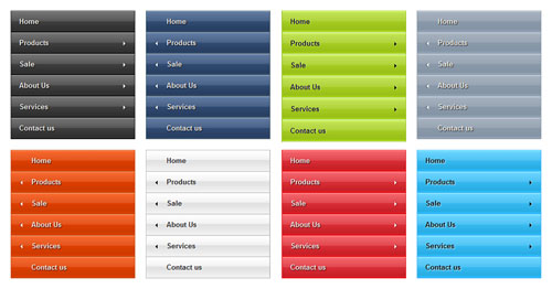
Five years ago, we published a post dissecting 26 of these menus, back when they were relatively novel.
In 2014, we revisited the topic, seeing that full-width menus with a greater number of products and featured images were en vogue.
So, what of 2016? Let’s have a look.
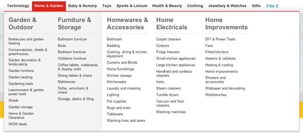
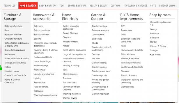
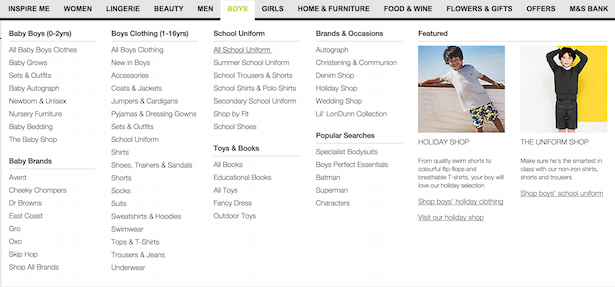
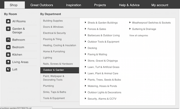
Argos
2016 might not look much different to 2014 but in the example tab below there are 82 categories now where there were only 53 in 2014. There’s also an additional way to shop (by room).
This increase is a trend for many ecommerce sites, comparing 2016 to 2014.
As a commenter on our 2014 post rightly points out, surfacing more products, creating specific journeys, is intended to serve the customer as soon as they arrive.
“..clear signs of the proliferation of content items that, over time, the managers of a site feel compelled to try and shove under the noses of their customers at the earliest conceivable point. More and more shopping journeys, of ever greater specific focus, start on the primary nav.”
2014
2016
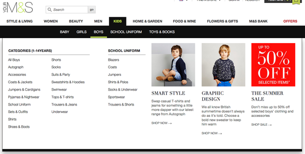
Marks & Spencer
The M&S menu now appears even more mega, partly because it has got rid of the secondary menu (in black in the 2014 image), using only one dropdown.
M&S doubtless wanted to avoid confusion in navigation by surfacing all relevant subcategories in just one rollover. This approach definitely adds clarity, even if it makes for more reading.
2014
2016
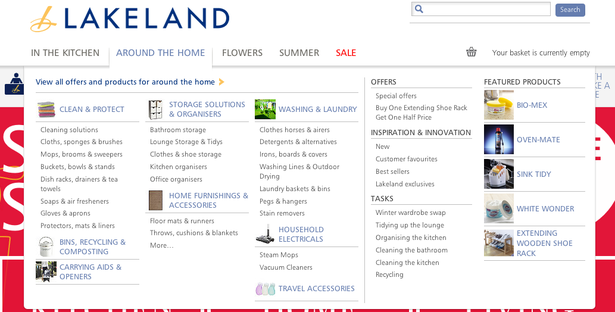
Lakeland
Lakeland has vastly increased the number of items/categories in its mega-menu, adding a secondary menu in each main category to create the extra space needed.
Offers are given more room to breathe on the right hand side of the menu, being much bigger in size and picked out with colour.
Note how the little thumbnail images have disappeared from subcategories, making everything better aligned and easier to read.
2014
2016
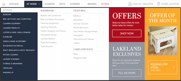
B&Q
Unlike M&S, B&Q has made more of its secondary menu. In 2014, a secondary menu did exist, but was limited to five departments. In 2016, the secondary menu in the shop tab has expanded significantly.
It’s notable here that B&Q has removed colour (no orange text or bullets) and bold subheaders, again trying to add clarity to the menu and make it easier to scan.
There are also a greater number of tabs on the main menu in 2016, bringing in new content, as well as ‘My account’.
In 2016, the room iconography on the left hand side is another addition intended to make things easier to scan, highlighting the links to room category pages.
2014
2016
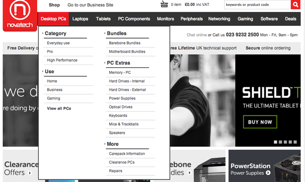
Novatech
Novatech’s website redesign has changed some of the menu listings and style, though not dramatically.
One of the interesting UX additions is a large, red button to ‘View all’ in a category.
This seems like a good option for retailers who fear that a mega-menu may intimidate some browsers.
2014
2016
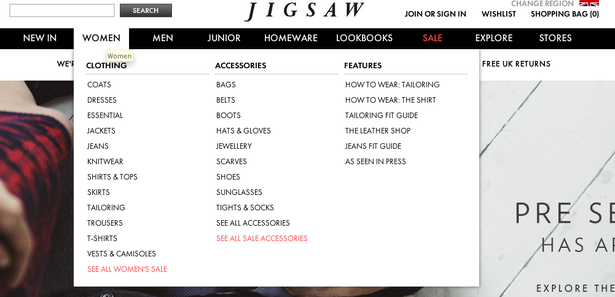
Jigsaw
Jigsaw has changed the titles of its main tabs, notably including one of the more popular product categories – shoes.
The fashion in 2016 web design seems to be consistent text colour, as red text has been removed from Jigsaw’s menu.
Yet again, significantly more items make it into the menu, along with an added subcategory of ‘Collections’, giving users new startpoints from which to browse.
Note the dropdown menu is now full-width, to include preview images.
2014
2016
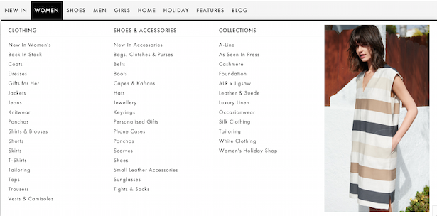
Monsoon
In the last two years, Monsoon has gone full-width with its menu, giving ‘offers’ their own tab and making the subcategories easier to pick out.
2014
2016
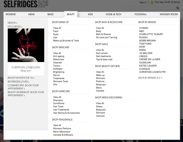
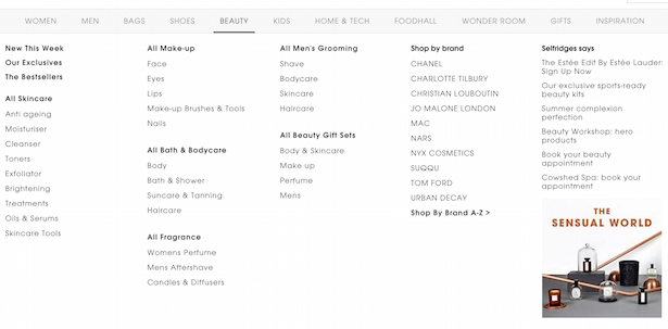
Selfridges
In 2016, Selfridges has added three extra tabs in the menu and the subcategories have been allowed to spread out.
This reduces the height of the menu and making it easier to take in, particularly on widescreen laptops.
2014
2016
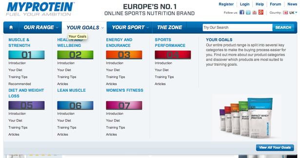
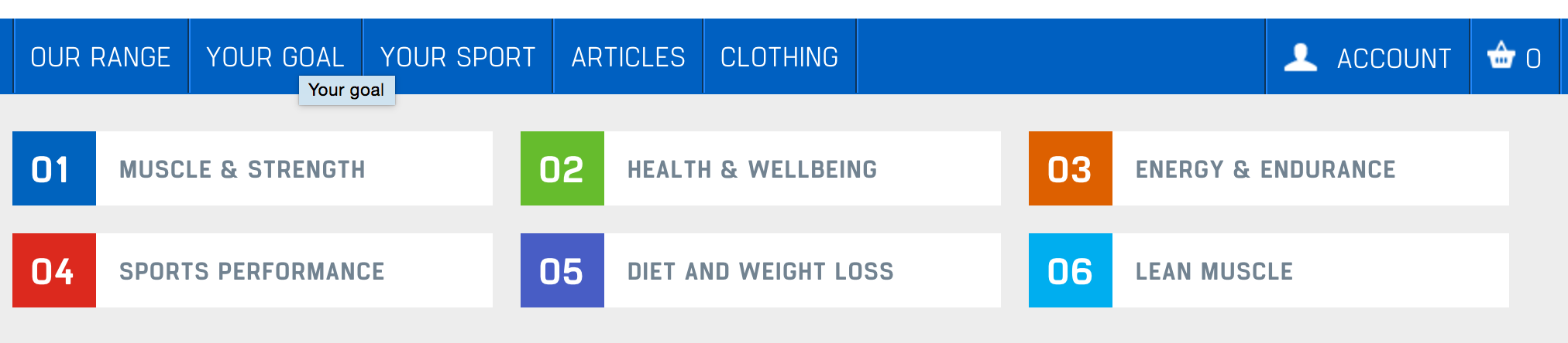
MyProtein
Interestingly, MyProtein is one of the few sites to have reduced the items in its menu, as shown in the ‘Your goals’ example below.
Partly, this may be because this area of the site is content-led and letting users enter the content in the middle may be undesirable or confusing.
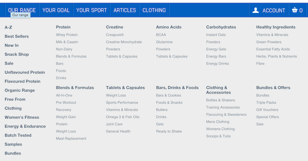
Certainly, the reduced menus for content-led ecommerce distracts less from the product listings in ‘Our range’ (also seen below).
2014
2016
The product listings in ‘Our range’.
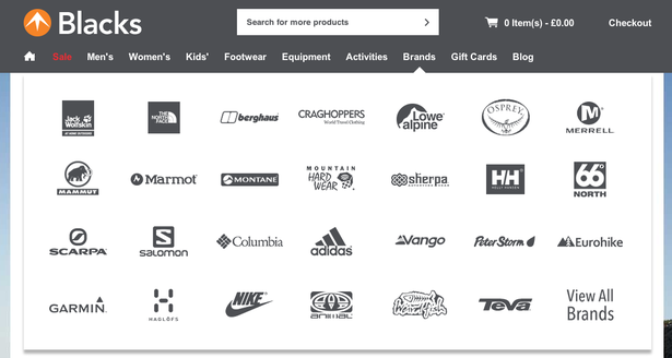
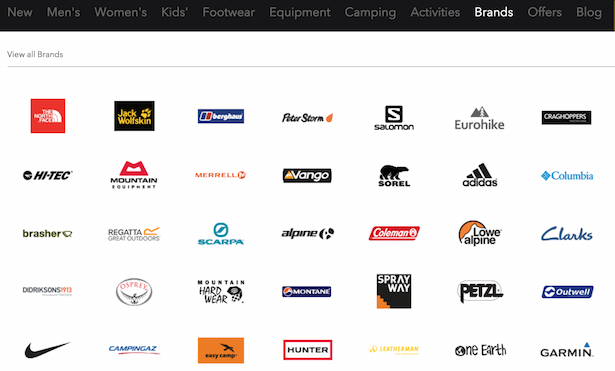
Blacks
Some of the category titles have changed in the Blacks menu, but not much else.
I thought I’d include a shot of the brands menu, now featuring colourful logos, which perhaps stand out more than the too-cool-for-school greyscale of 2014.
2014
2016
Wiggle
Wiggle has had a makeover, with only black text and links, and no bullet points.
2014
2016
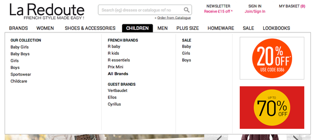
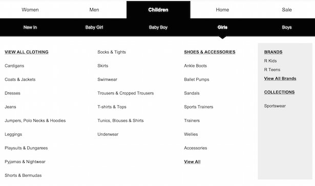
La Redoute
La Redoute has added a secondary menu in order to add a whole host of subcategories.
2014
2016
Conclusion
In general, mega-menus on desktop are even more mega in 2016 than they were in 2014.
The aesthetics of mega-menus seem to focus on clarity, with more room for text and more consistent formatting. Colours have generally disappeared, as have bullet points.
Menus are still somewhat horses for courses, particularly when it comes to secondary menus and imagery but, call me naive, it seems like ecommerce UX is maturing and I wouldn’t expect to see much change when we review mega-menus in 2018.
by: Ben Davis | Econsultancy